Before
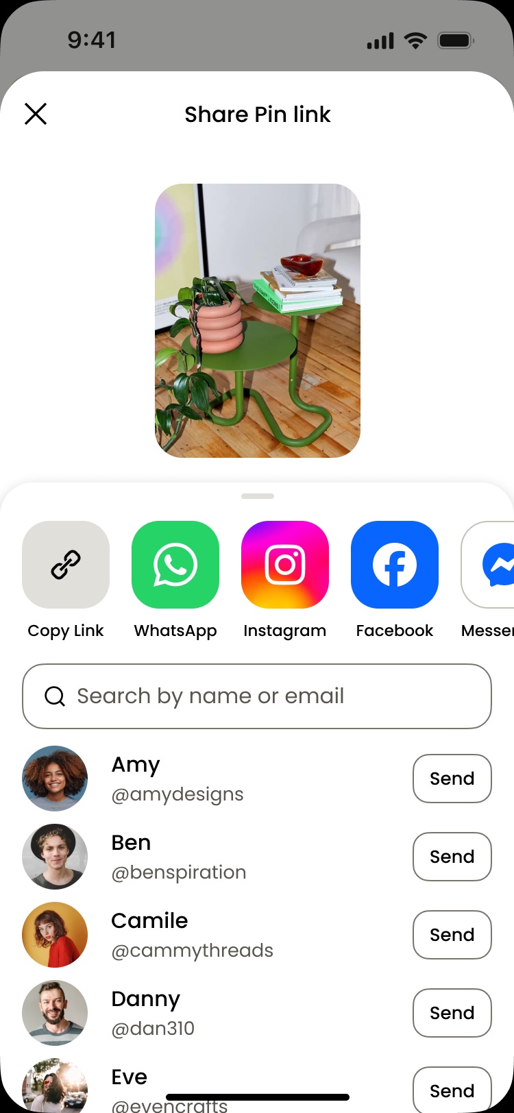
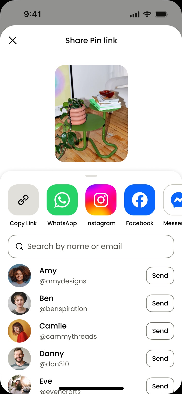
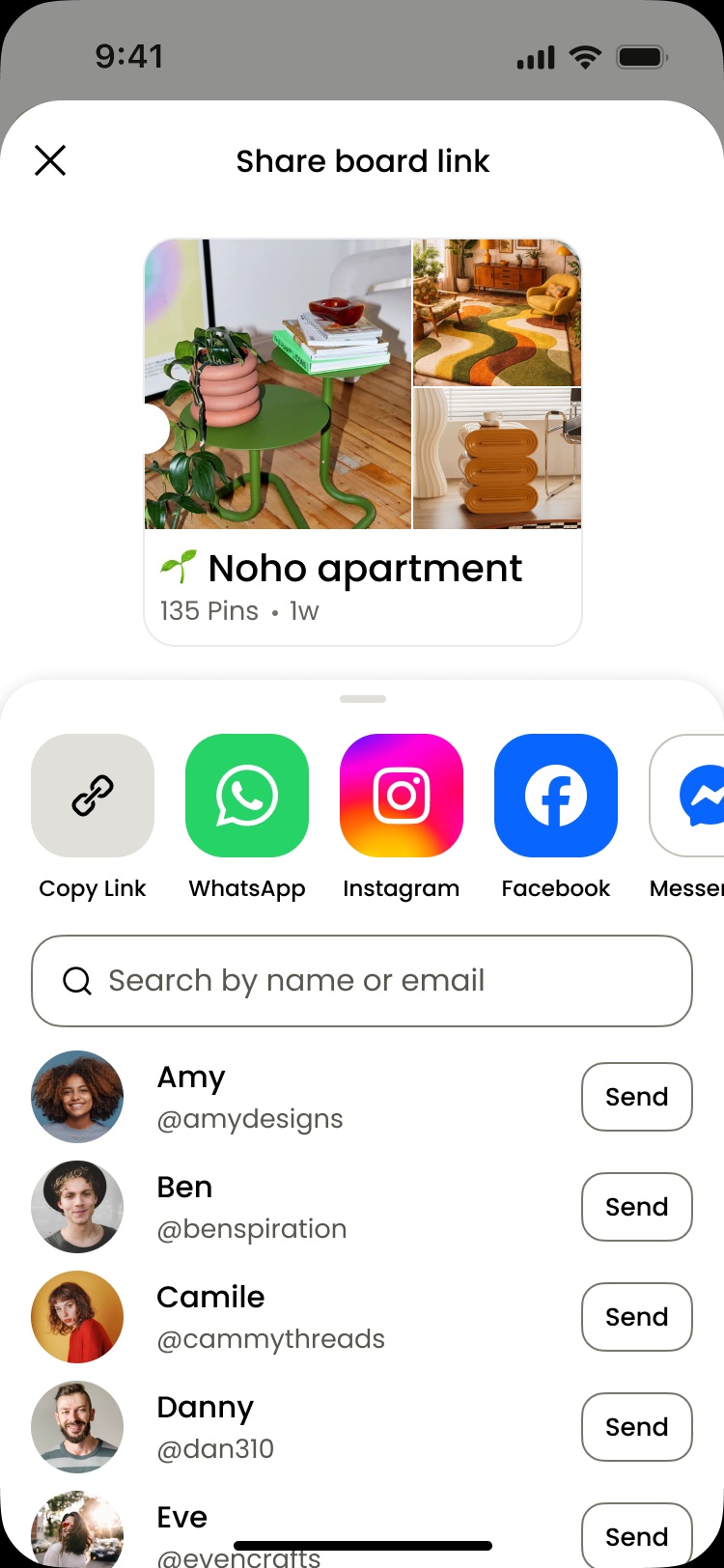
Unclear hierarchy and distracting visuals drove confusion and drop-off. There were 17+ apps with no ranking, overly technical copy, and a hazardous one-click send with no way to revert.
Case study
80% of users who opened the share surface exited without completing a share. Research showed unclear hierarchy and distracting visuals created confusion and drop-off.
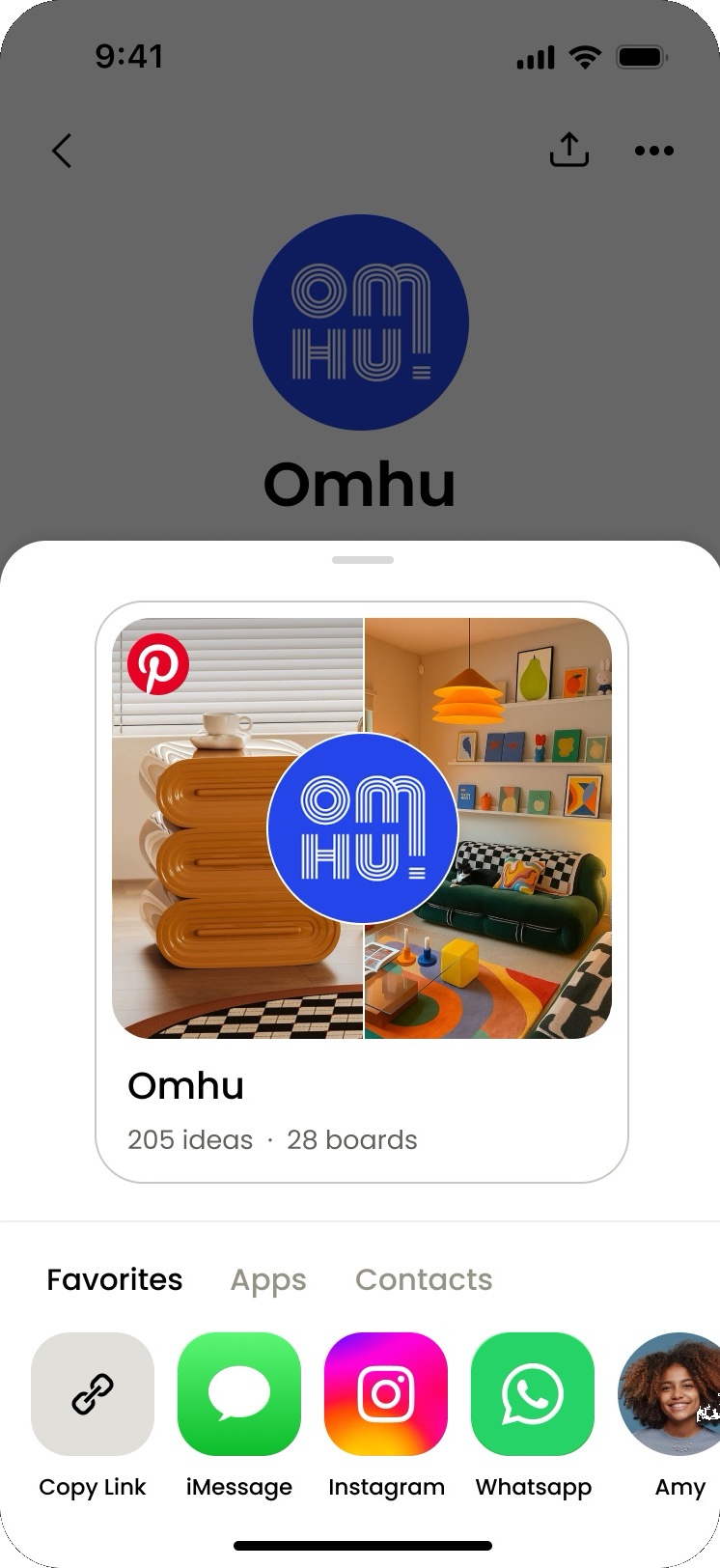
Simplified the sharing experience with a clearer information hierarchy and more intuitive sending flow. Built a scalable visual system to better represent shared content off-platform.
+11% successful shares
+6% monthly active users
Unclear hierarchy and distracting visuals drove confusion and drop-off. There were 17+ apps with no ranking, overly technical copy, and a hazardous one-click send with no way to revert.
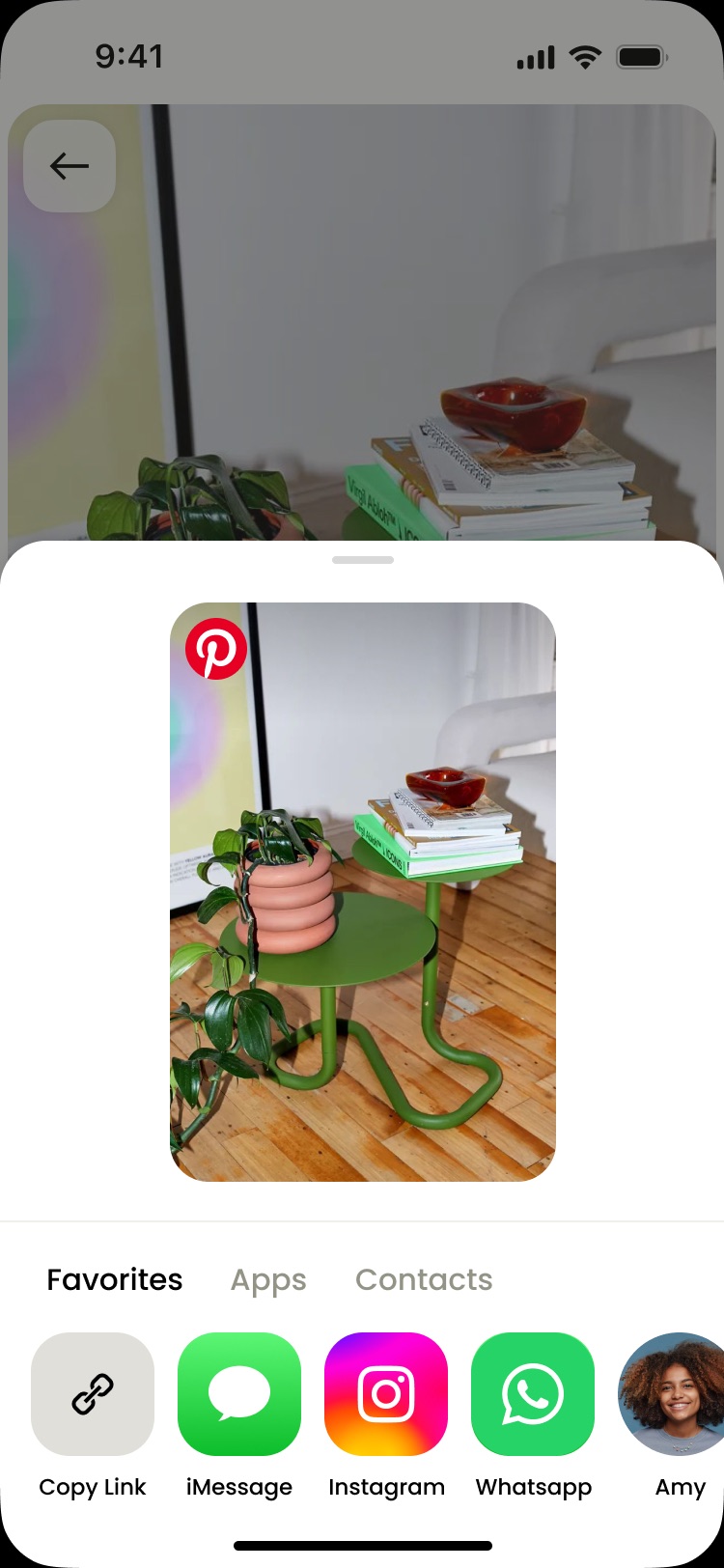
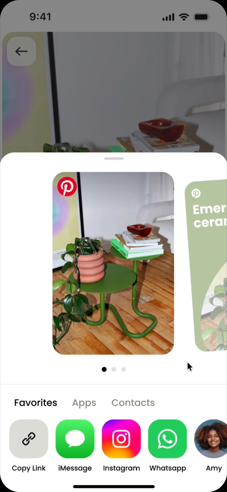
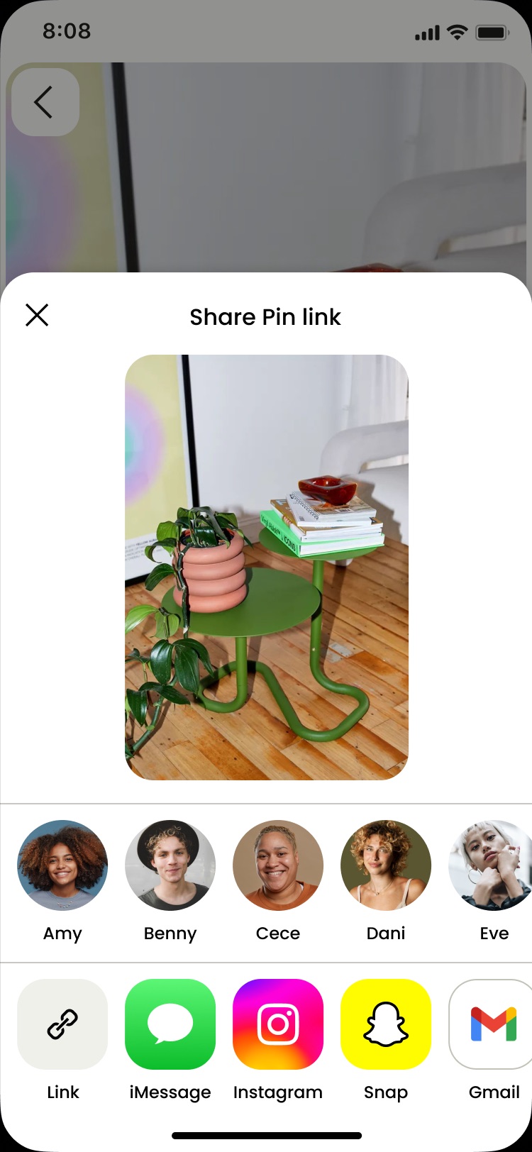
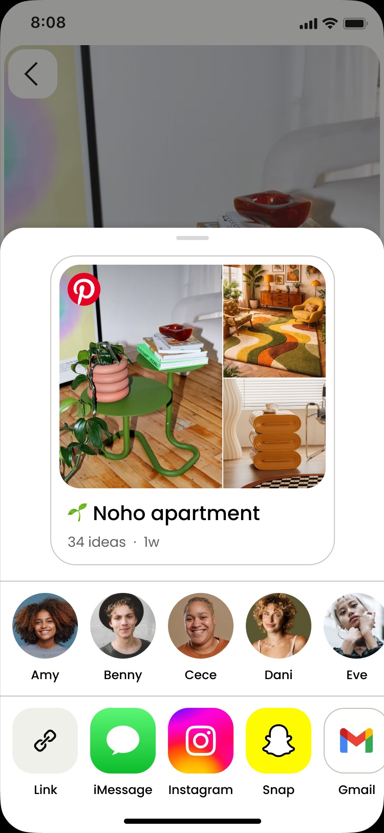
A clearer information hierarchy and more intuitive sending flow, with channels ranked by recency. A scalable visual system better represents shared content off-platform.
01
The ask
Partnered with our data scientist, I discovered there was 40M monthly active users coming from sharing, and that users who shared were 3 times as likely to retain.
Sharing promotes organic growth
Discover ideasShare with friendsCome to Pinterest80% of people that open the sharing surface don’t share anything. Pinterest missed out on potential MAU gains from users with intent to share.
Research showed sharing was confusing and didn’t meet user expectations. Participants described sharing as confusing, without focus, clunky, and untrustworthy.

Irreversible sharing risked user trust, compliance, and regulatory violations. Sending was one-click with no way to revert, and 4 clicks to continue messaging.

Hypothesis
Goal
02
Most people shared with fewer than 3 friends and used fewer than 4 apps, yet the sheet led with 17+ unranked options and overly-technical copy. Too much choice, too little clarity.
I introduced three iterations to the control experience which drove sharing by 1%. Though these changes showed promise - the total outcome fell short of our goal.
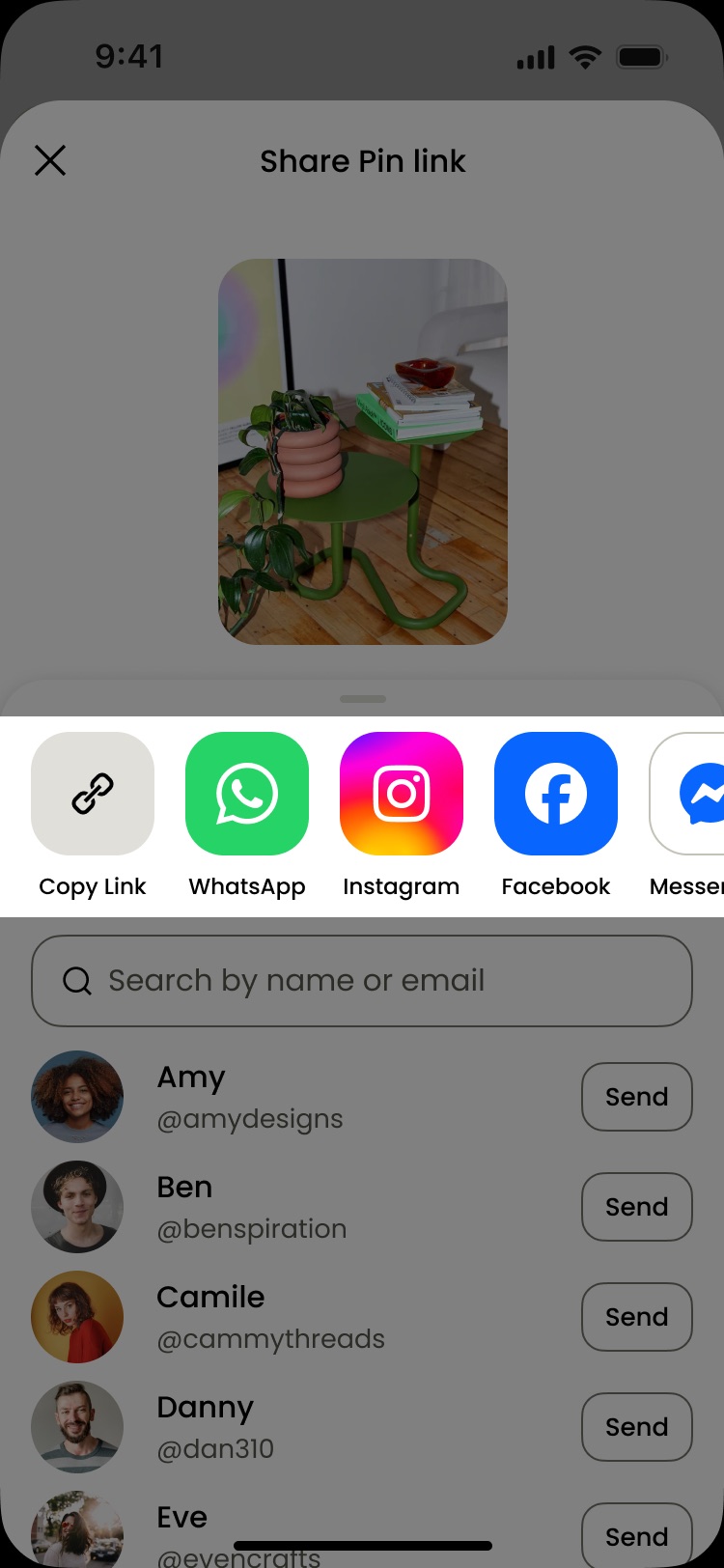
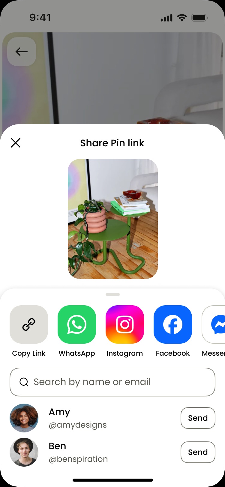
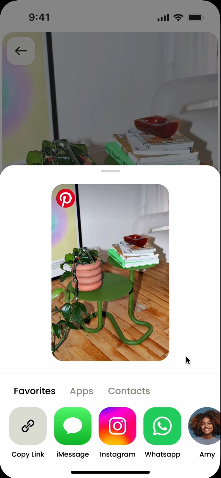
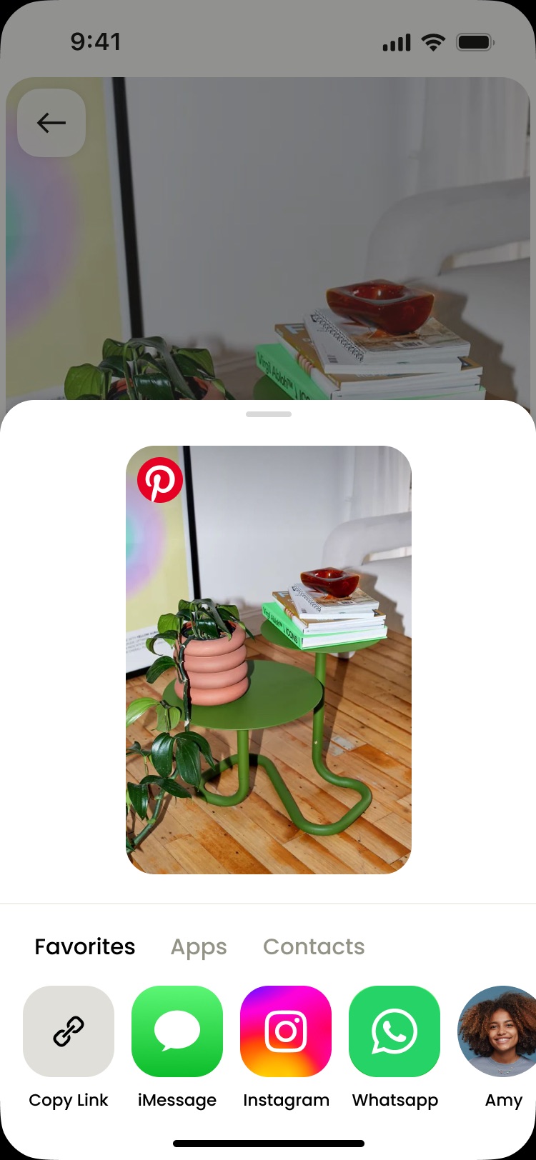
Apps were sent to more than anything else, so why not put them right under your thumb? Moving them to the bottom of the sheet, closest to reach, could make sending effortless and drive more shares.
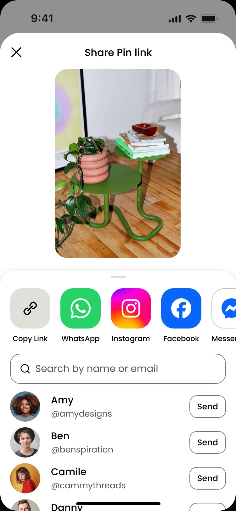
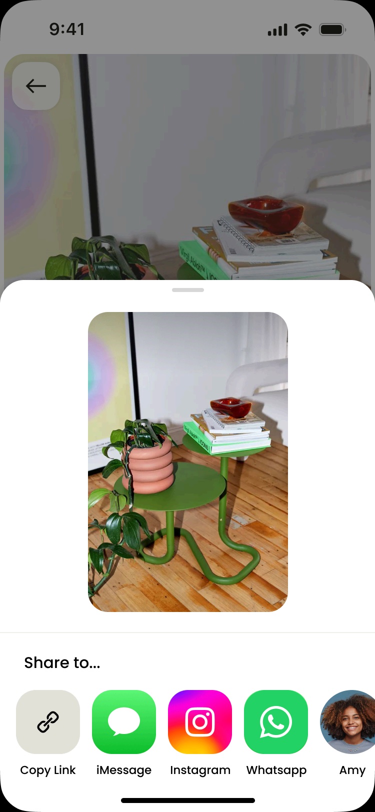
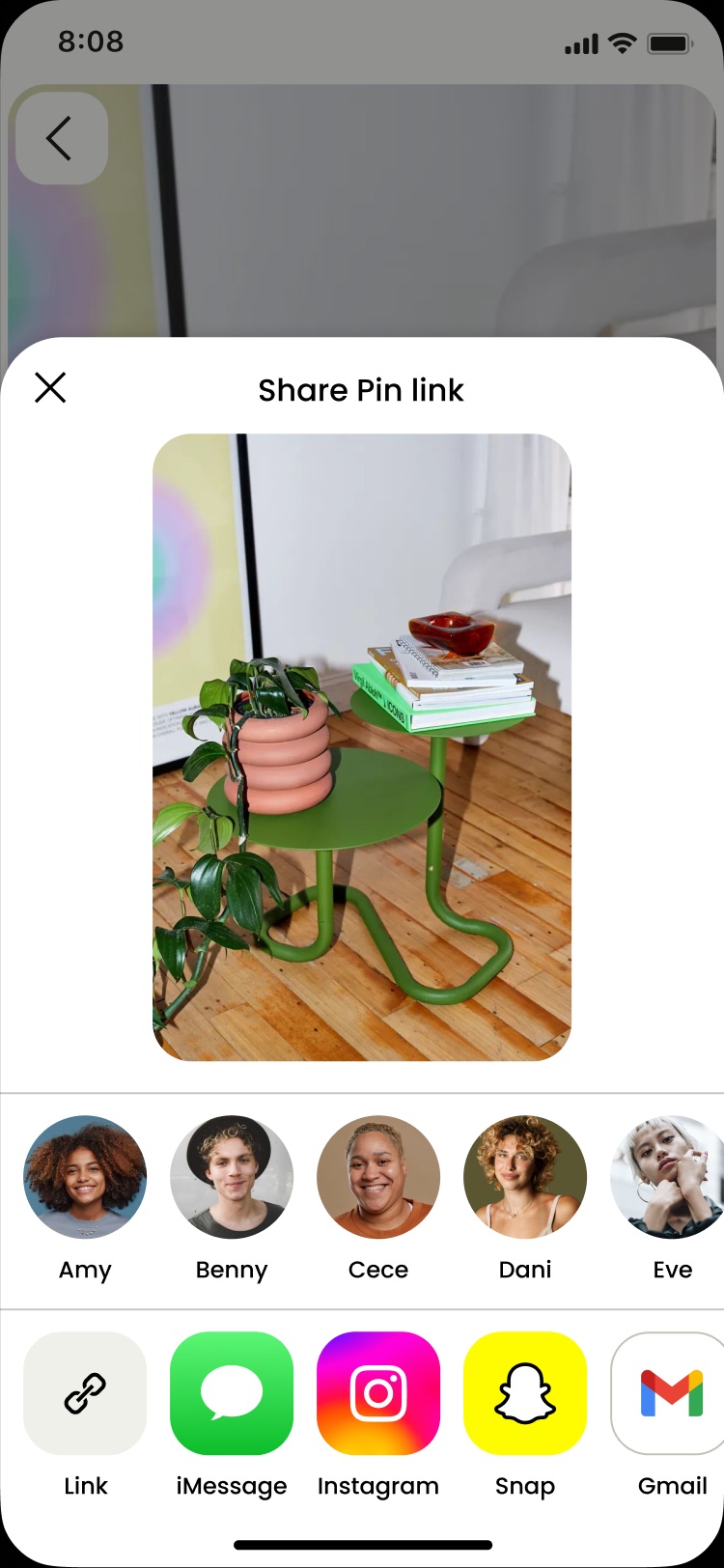
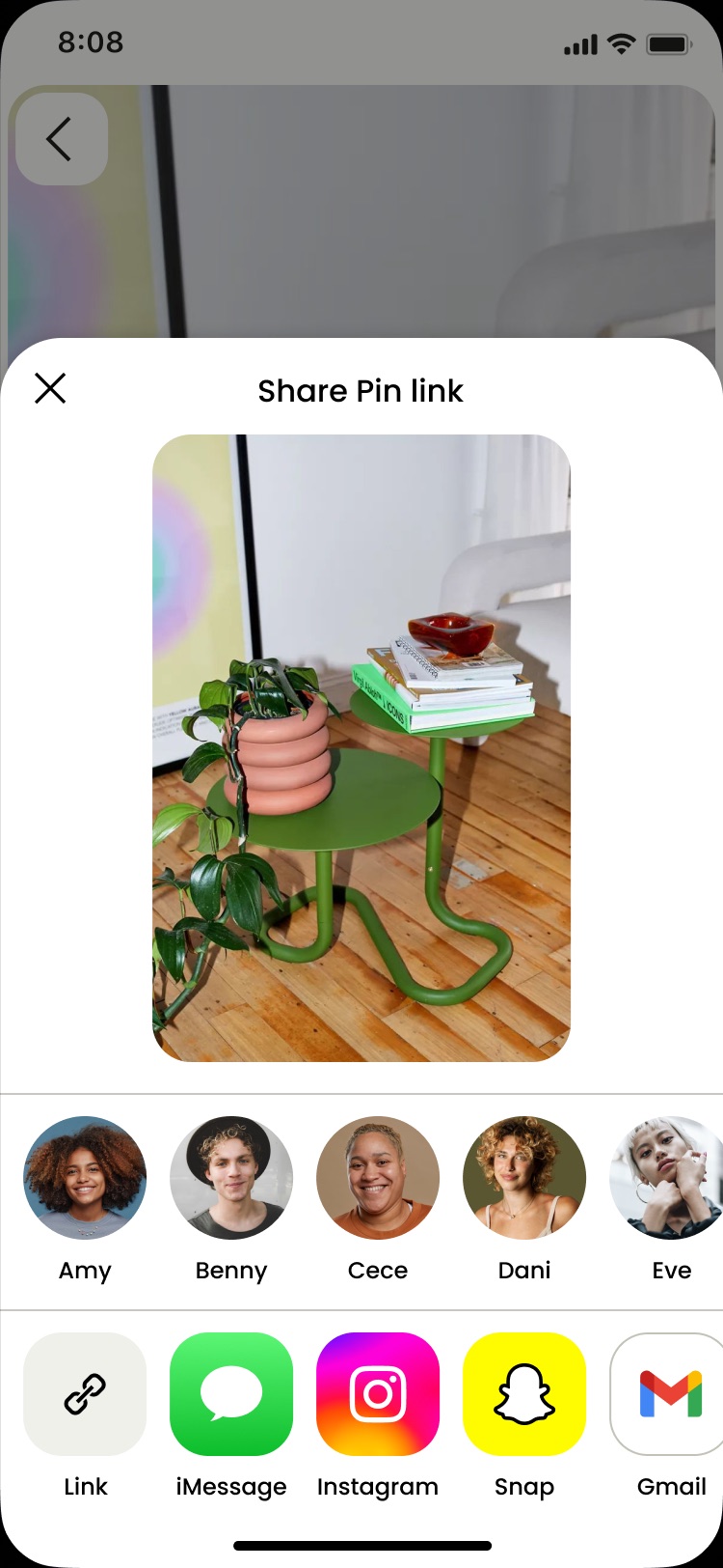
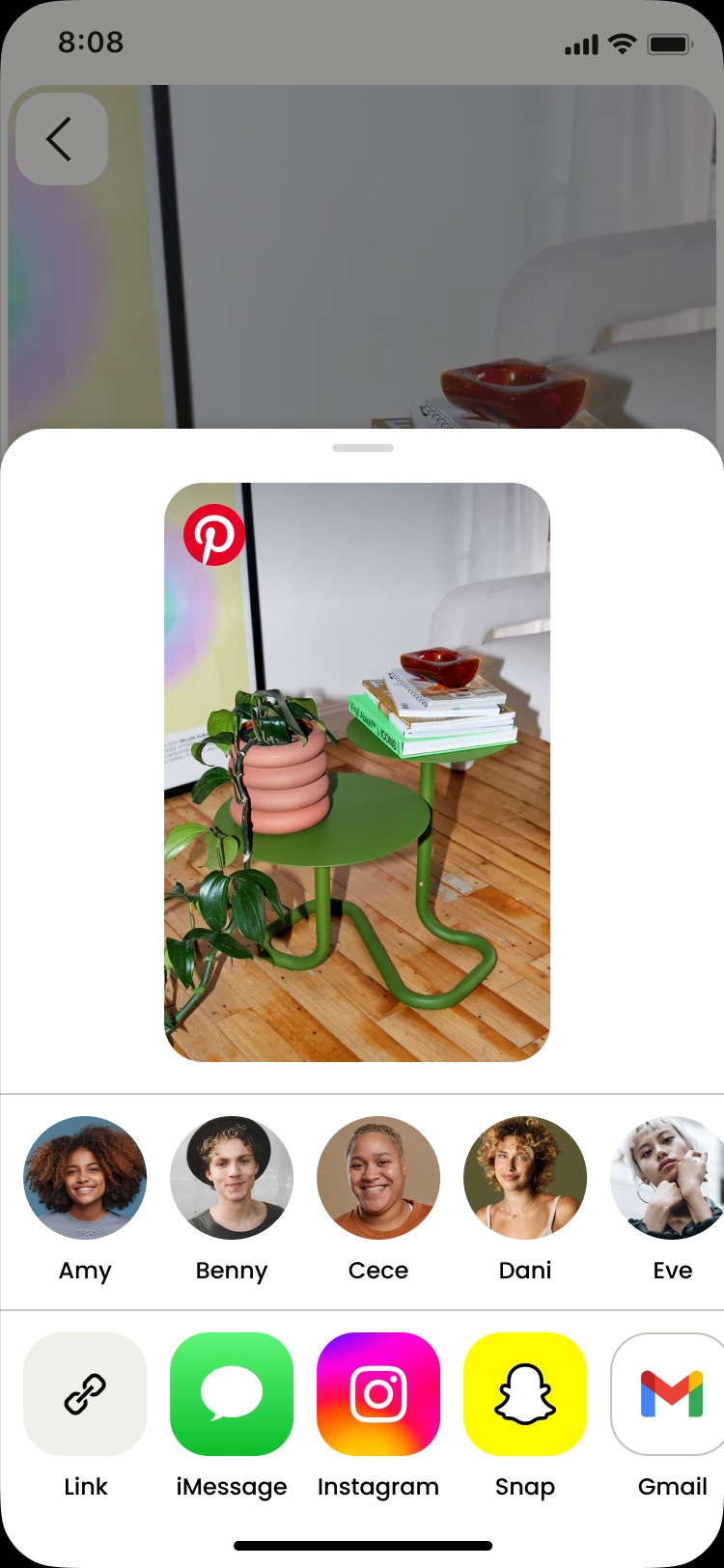
If you can see exactly what your friend will get, you’re more likely to hit send. A bigger, truer preview of the Pin should take the guesswork out of sharing.
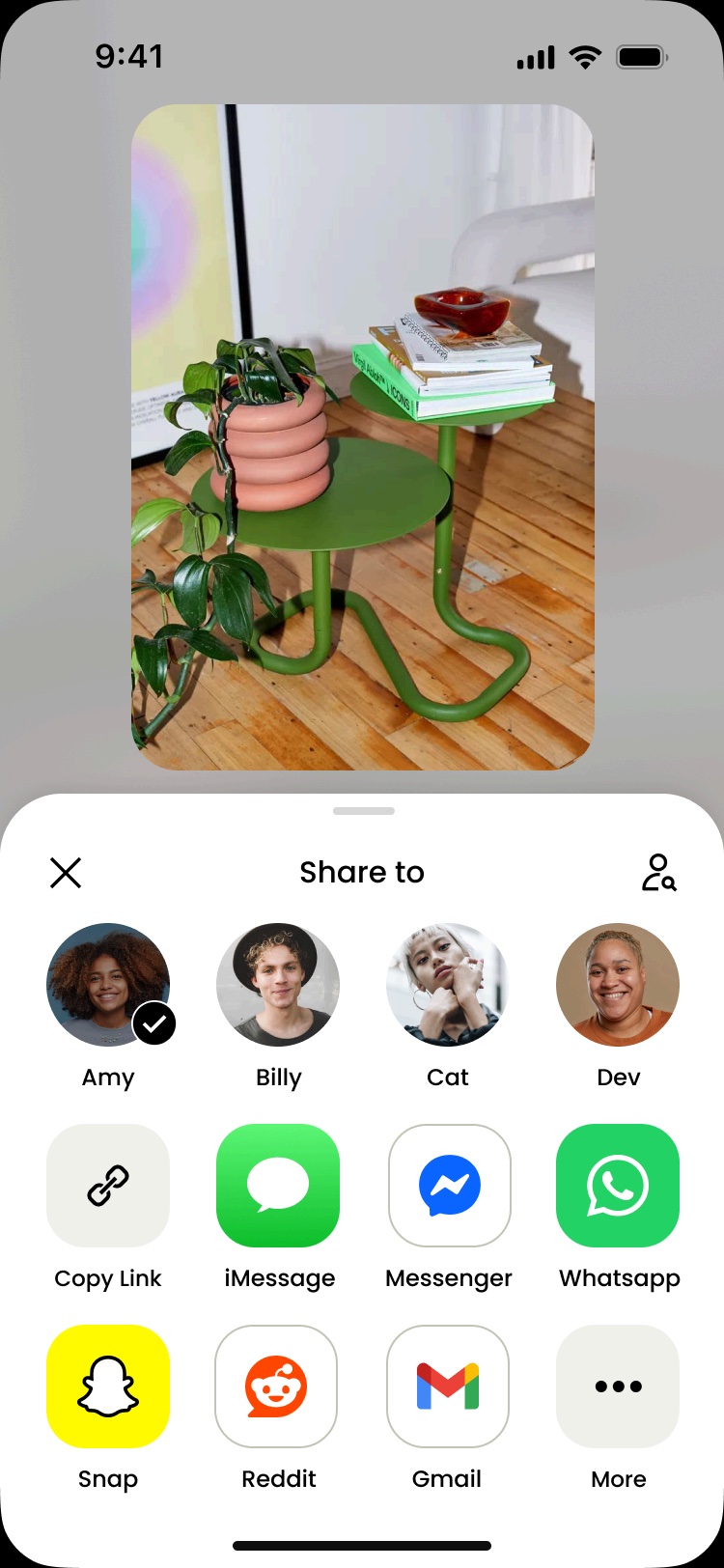
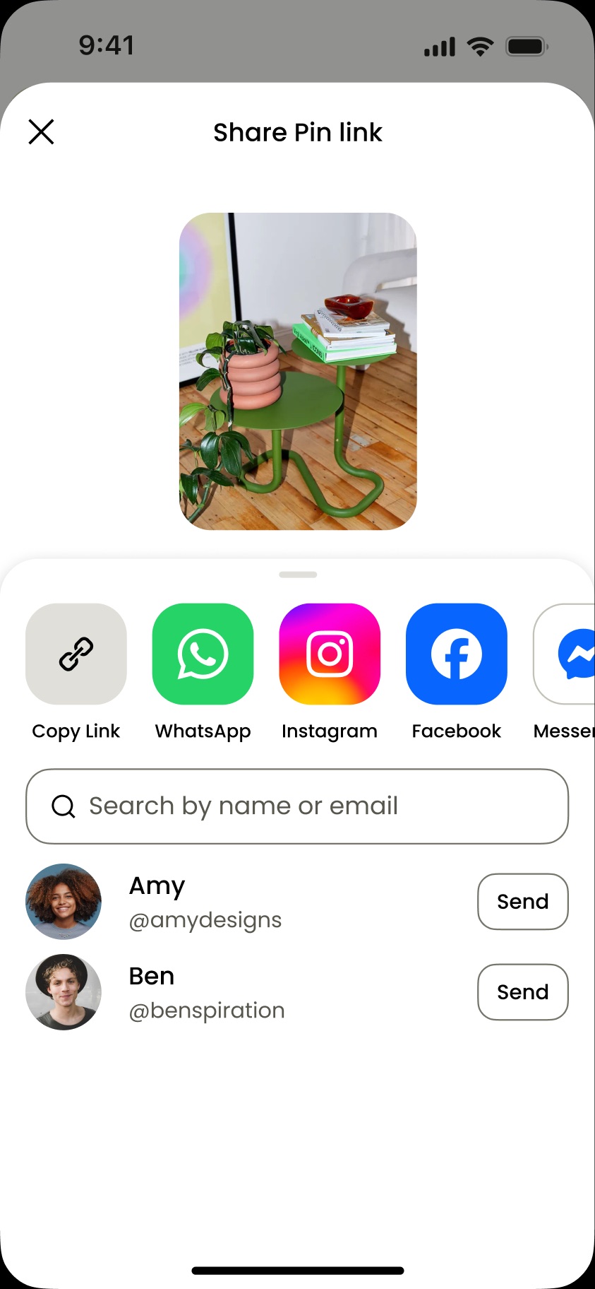
Maybe less is more. Cutting the sheet down to a few ranked options and one clear action could clear up the confusion that had people bailing.
03
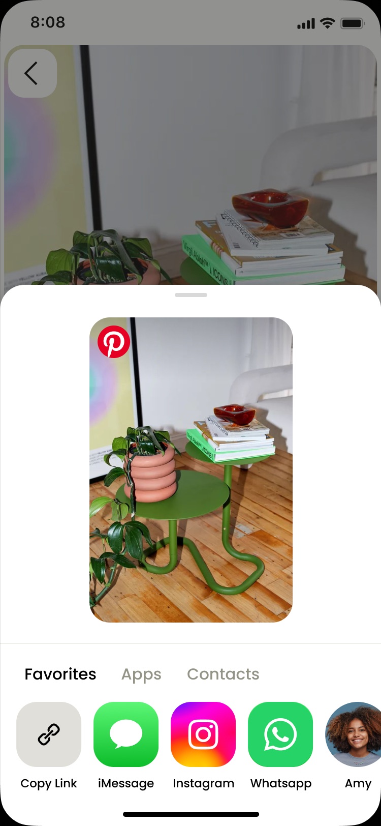
Keeping every channel in one row meant relying on a long horizontal scroll to reach actions, a poor usability pattern that buried the options people needed.
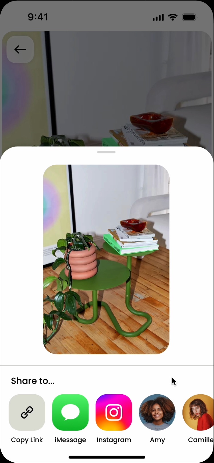
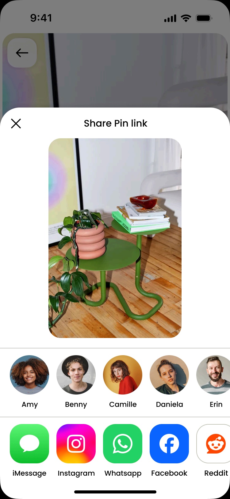
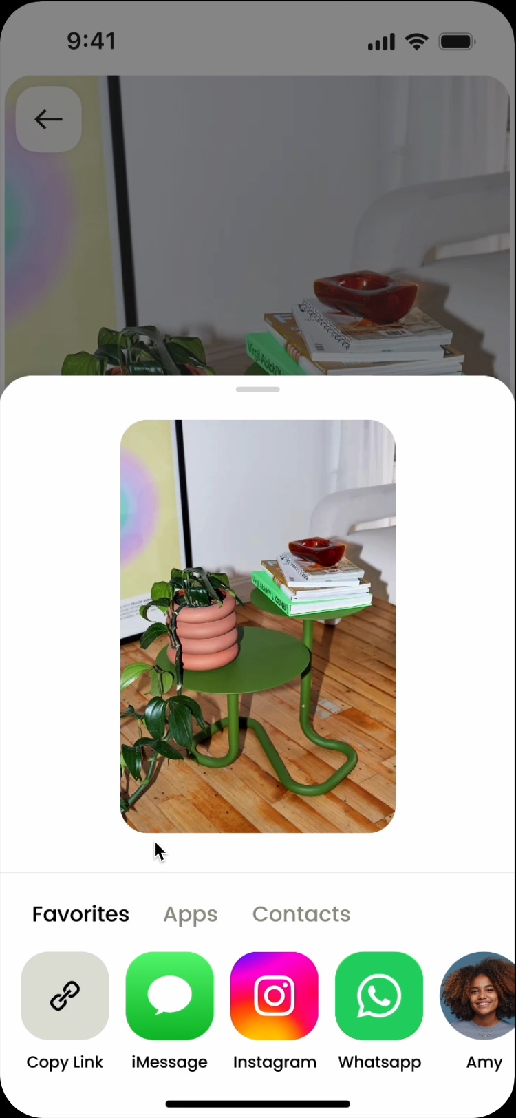
I aligned the team on a new tab UI that logically grouped actions, so every channel stayed a tap away without the scroll.
New heuristic
I created a solution that ranked channels by recency - capped at 7 options per tab to capture 95% of share volume.



Resolved dark pattern
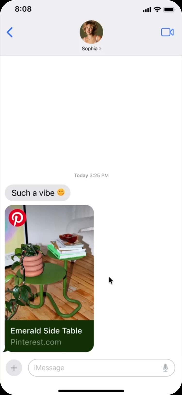
Removed auto-send to restore confidence, and enabled direct entry into messages.
Tapping a friend sent the Pin instantly, with no way to undo it. Continuing the conversation in messages then took 4 more clicks.
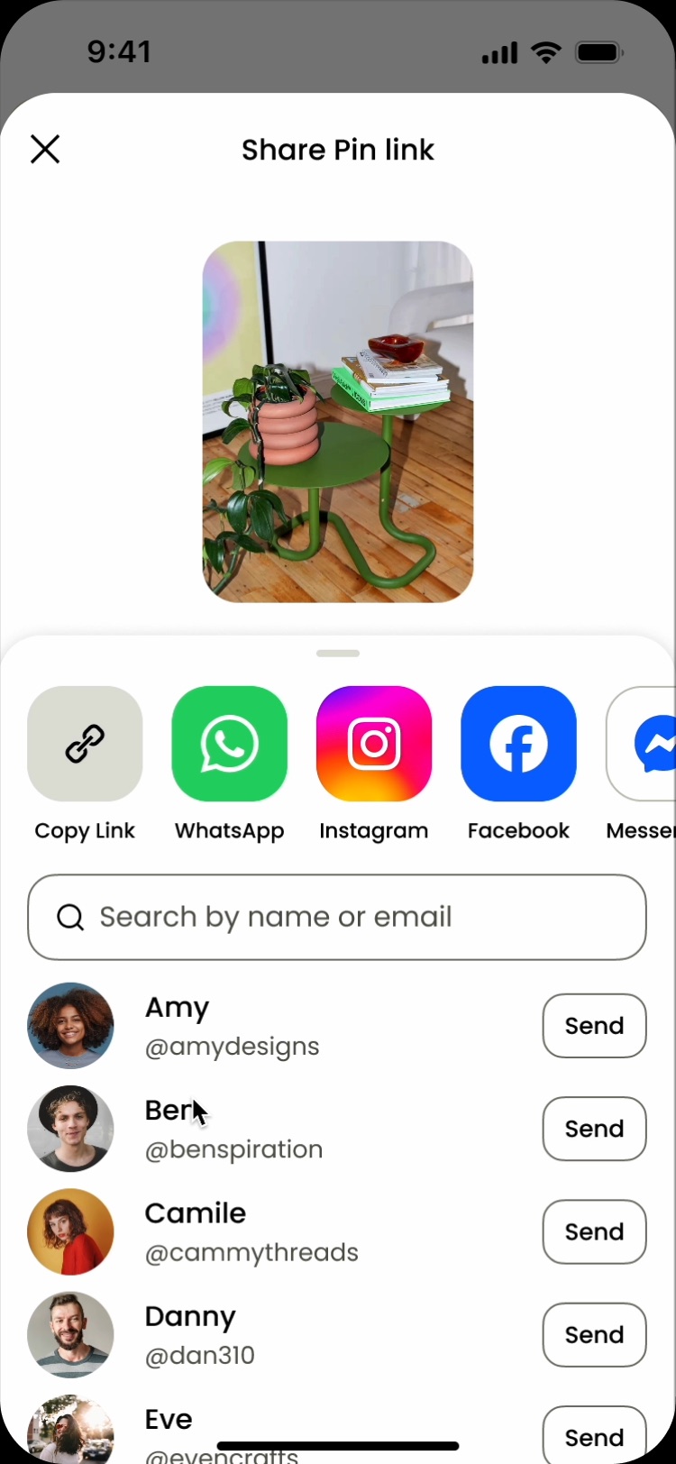
Sending became a deliberate step people could trust, and a direct path into messages kept the conversation going.
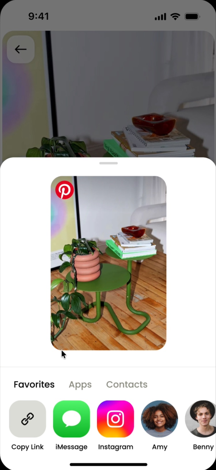
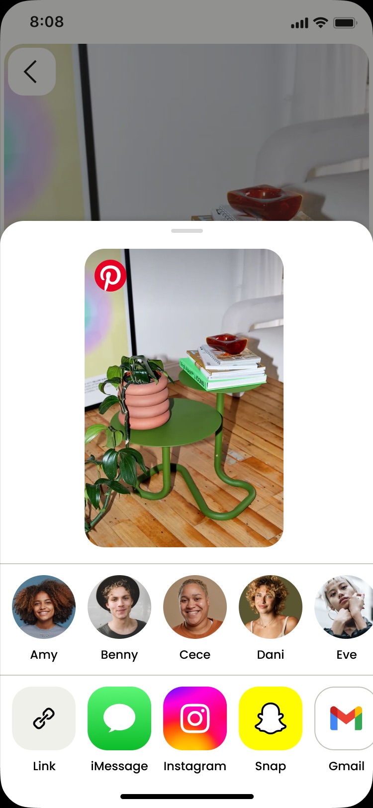
Adding the Pinterest logo to every shared Pin made it clear where it came from, for both the sender and their friend, so the link felt safe to open.
Usability study
I usability tested the refreshed design with 12 participants, who described it as simple, with clear direction of how to operate it. They wanted more expressive formats to share in.
“It feels simpler. Everything I need is right there - I don’t really have to think about it...”
Research participant
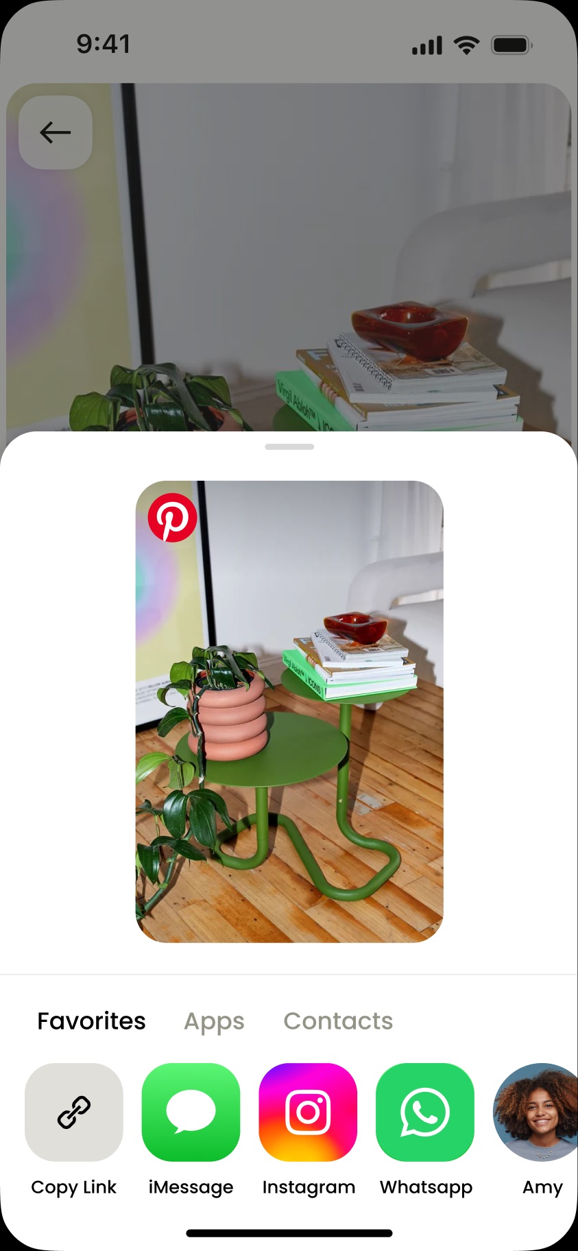
04
Shareable media came in 6 types, each with its own bespoke component. I designed one component that scales in height and can be reused anywhere in the sharing surface.
Each media type was built as a one-off, so boards, profiles and Pins all looked and behaved differently.
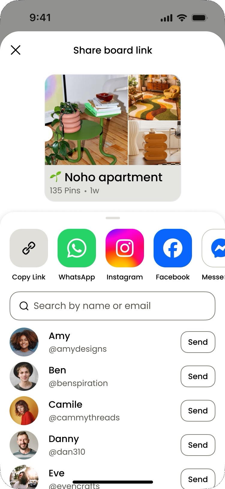
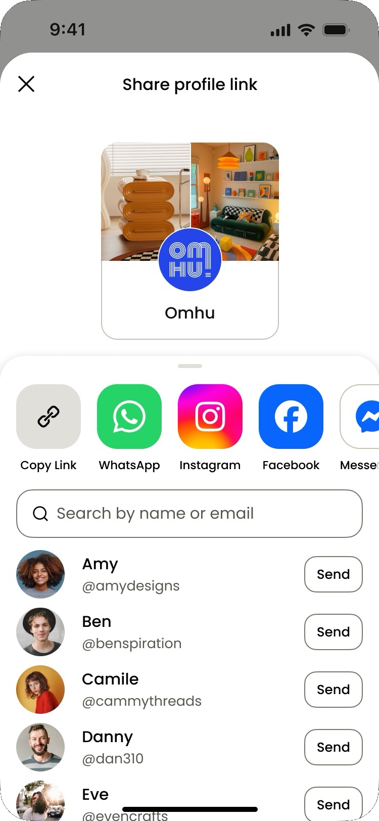
One component flexes in height to fit any media, giving every share the same clear, recognizable look.
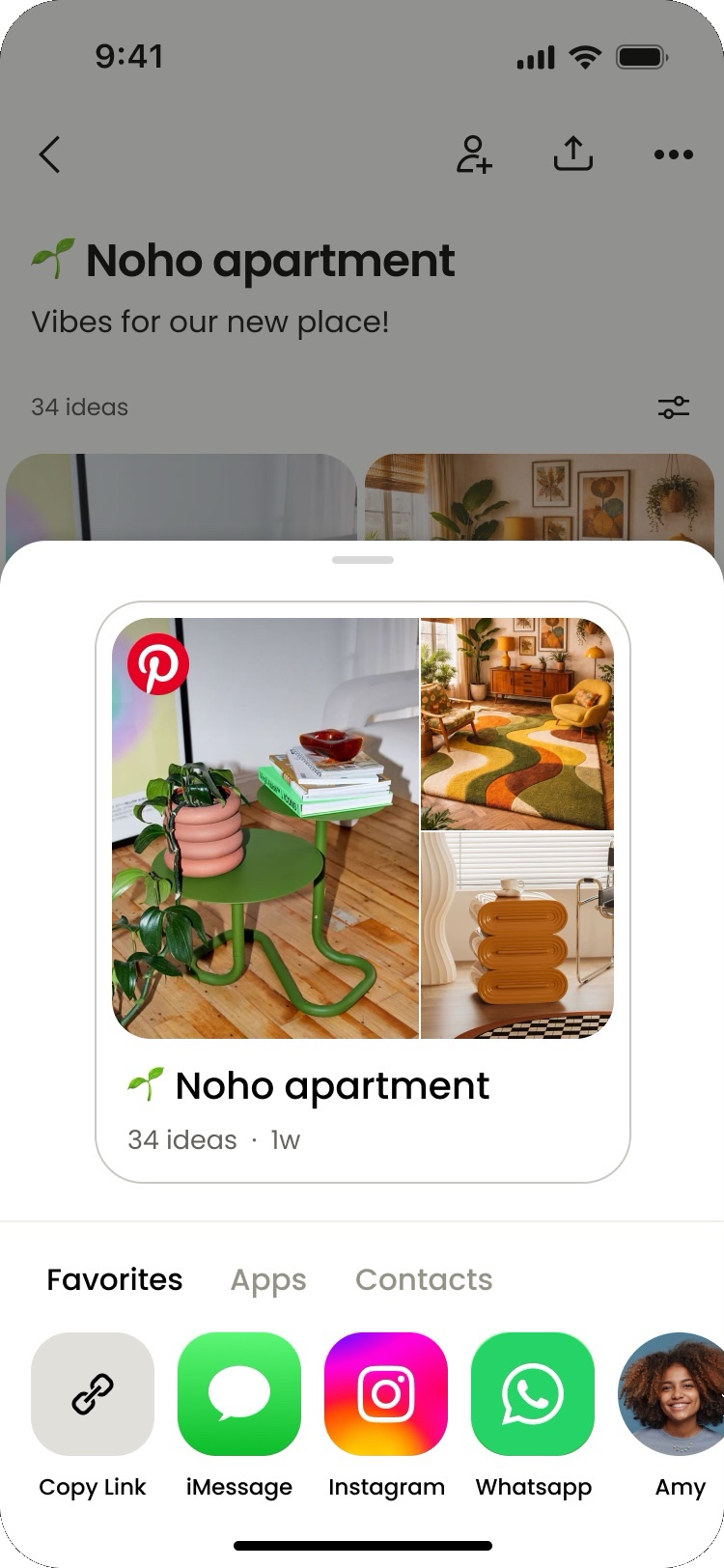
I led a sprint teaching 20+ designers, PMs, and engineers to use Figma Make, rapidly exploring the expressive formats Gen Z users craved.
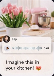
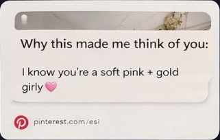
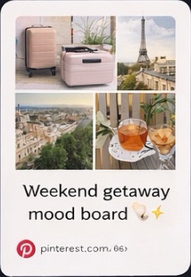


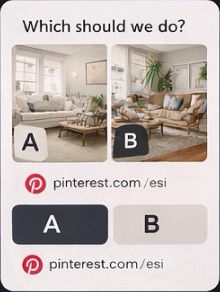
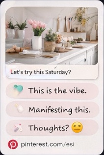
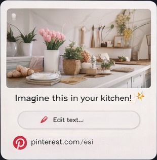
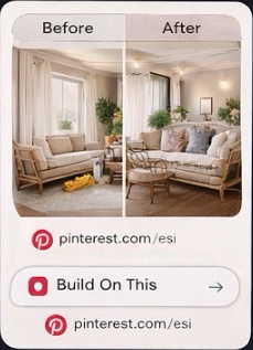
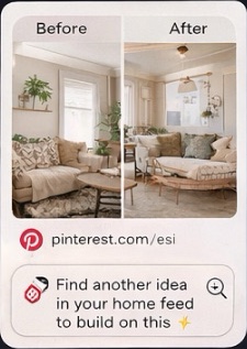
The new sharing surface gave space for more expressive media to be sent - which delivered on a prominent ask from Gen-Z from research throughout this initiative.
05
Experiment strategy
Suggested to test a growth-friendlier option first, before introducing tabs.
01
+6% shares
Fewer, better-ranked options meant people spotted who or where they wanted to share right away, instead of giving up mid-scroll.
02
+1% shares
Dropping the sheet title and extra chrome put the Pin front and center, so there was less to take in before sending.
03
+1% shares
A cleaner, more modern look made the sheet feel trustworthy, nudging a few more people to follow through.
04
+3% shares
Grouping friends and apps into tabs made a long list feel short, so people got to their go-to channel faster.
06
Simplified the sharing experience with a clearer information hierarchy and more intuitive sending flow. Built a scalable visual system to better represent shared content off-platform.
+11% successful shares (vs. 4% goal)
+6% monthly active users (vs. 1% goal)
What got us here, won’t always get us there. Incremental fixes to legacy UX drove learnings, but not big impact; vision-driven thinking did.